Know what it would take to keep each of your teams, before anyone leaves.
PayTruth gives you retention pressure by role and location: what your people are paid against the public market, and what the labor economics says that means for who stays. Every number it shows you can be checked against public data.
Request access See how it worksAttrition is expensive, and it is quiet until the exit interview.
By the time an exit interview tells you why someone left, the replacement clock has been running for months.
Replacement-cost range: SHRM and Gallup estimates for mid-skill and senior roles; regulated and clearance-bearing roles run higher.
How PayTruth works
Four steps from your workforce file to a defensible view of retention pressure, grounded entirely in public wage data and published labor economics.
Your workforce in, aggregated out
Import a CSV with role, location, salary, tenure, satisfaction, and job-search status per employee. Today that is a file export from any HRIS. Rippling integration (in development) does the same thing continuously through their API.
Employee rows are processed and immediately reduced to groups by role and location. The dashboard has no individual view by design; see the privacy section below.
Every group is benchmarked against the real market
We match each role and metro to the Bureau of Labor Statistics OEWS distribution: 25th percentile through 90th, for 830 occupations across 393 metro areas, refreshed with the May release each year.
Every pay figure on your dashboard can be checked against public BLS tables. If we say your Software Developers in Phoenix are at 0.97x market median, that is a number you can verify.
The tolerance model quantifies the gap
For each group we estimate the salary tolerance distribution: the pay level at which your employees would seriously consider leaving. It is built from reservation wage research, anchored on current pay as the literature says workers anchor, then adjusted for satisfaction, job search, and tenure.
The same calibrated model powers the worker-facing tool at paytruthapp.com, so the assumptions are written down and cited, and they ship with version history.
You get groups, tiers, and a price tag
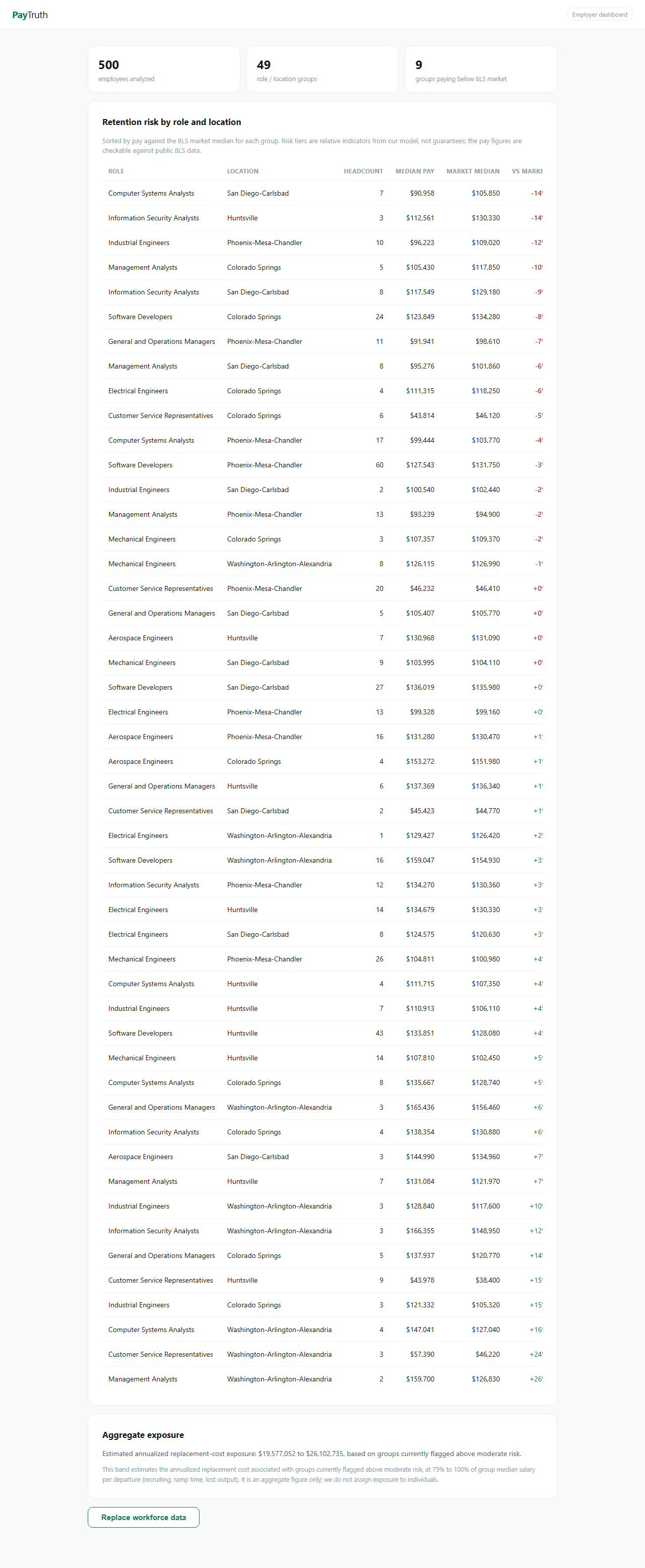
The dashboard ranks every role-location group by pay against market, flags the ones paying below their BLS median, and assigns a relative risk tier. An aggregate exposure band estimates what the flagged groups cost you per year in replacement risk.
The action is concrete: for flagged groups, the dashboard tells you the distance to market median and what closing part of that gap is worth against estimated departure cost.
What you see
A live screenshot of the actual product, not a mockup.
Methodology, in plain terms
The model is the product. Here is exactly what it does and what it does not claim.
What the numbers are
Pay-versus-market is arithmetic against public BLS tables. Tolerance estimates come from a two-stage model: a market-anchored base, then bounded adjustments for satisfaction, active job search, tenure, and local cost of living.
What the tiers mean
Risk tiers are relative: high, elevated, moderate, low. They compare groups against each other and against the model. They are not guarantees about individuals. We publish the band logic and change it only with a changelog entry.
What we deliberately do not claim
No individual flight-risk scores. No probability that a named person quits. The model is worker-opt-in-biased by construction and we say so; anyone selling you certainty about a specific person is selling overfit.
Underlying research
Reservation wage and pay-anchor literature: Krueger & Mueller (AEJ: Economic Policy, 2016), Jager, Roth, Roussille & Schoefer (QJE, 2024), Davis & Krolikowski (Cleveland Fed, 2024). Full citations in the worker app's methodology page.
Privacy
Most vendors handle this with a paragraph of policy. We built it into the product's architecture instead.
Your employees' data stays yours, aggregated. Imported rows are reduced to role-and-location groups. The dashboard and API cannot display an individual because the data model cannot represent a person, and automated tests in our codebase enforce that.
Worker app data never flows to employers. People who use the free tool at paytruthapp.com are never identified to their employer. Employer dashboards see aggregate distributions by role and location, and if a group is too small to be anonymous, it does not display at all. The dataset is worth having because workers trust it enough to answer honestly.
Integration
Start with a file. Move to an API when you are ready.
Today: CSV import
Export a workforce file from any HR system with six columns: role, location, annual_salary, tenure_years, satisfaction, job_searching. Import takes seconds, re-imports replace cleanly, and role titles are matched against the BLS OEWS occupation list with metro-level locations.
In development: Rippling
Native integration with Rippling's employee and compensation APIs, so the dashboard stays current without exports. Scoped read-only access, OAuth through the Rippling App Shop, and the same aggregation boundary as the CSV path. Early partners get founding pricing and a direct line to the roadmap.
Pricing
A single rate. No tiered packages to decode.
- Every role-location group in your workforce, benchmarked against BLS data
- Relative risk tiers with published band logic
- Aggregate exposure band for budgeting
- CSV import now, Rippling integration at no extra cost when it ships
- Methodology calls with the founder, not a customer success script
Roughly 20x to 50x: the annual cost against one prevented departure.
Questions we expect
Is this just engagement survey data with a coat of paint?
No. Survey data asks people how they feel, annually, and trust in the answer decays the moment it is collected. PayTruth anchors on what people are paid against a public, auditable market benchmark, which is the strongest single predictor in the reservation wage literature, and refreshes whenever your workforce or the BLS data does.
Could this feel surveillance-y to our employees?
That concern is exactly why the architecture looks the way it does. Employers see groups, never individuals. There is no per-person score for a manager to weaponize, because the product cannot produce one. Employees using the public tool are told the same thing in writing: their inputs are never shared with their employer, individual data is never sold.
What if our job titles do not match BLS categories?
Import reports unmatched titles explicitly rather than silently dropping them, and the mapping is editable. Most corporate titles land on an OEWS occupation cleanly; edge cases we resolve with you during onboarding.
How current is the market data?
The BLS OEWS May release lands each spring; we ingest it and version the change. Between releases the model adjusts for local cost of living. Every dashboard figure shows which data vintage it is computed from.
Why is there a $500 minimum?
Because the first ten customers get founder-led onboarding, a methodology walkthrough, and title mapping help. The minimum covers the cost of that attention, and it is far below the cost of the turnover it targets.
Request access
Employer dashboards are rolling out to a small group of design partners now. You get the full dashboard today via CSV import, founding pricing locked, and direct input on the Rippling integration priority list.
Email info@paytruthapp.com with your company name and rough headcount. You will be talking to the founder, and you will get a reply within a day.
Prefer to see it first? The worker-facing tool is live at paytruthapp.com. Run your own title and metro through it.